Ihr Warenkorb
Total
0.00
Continue Shopping
32KT020 Ultramarine Blue 1931
Bitte auswählen
Finish wählen
Menge
Ausreichend für ca. 4 m²
Grundierung
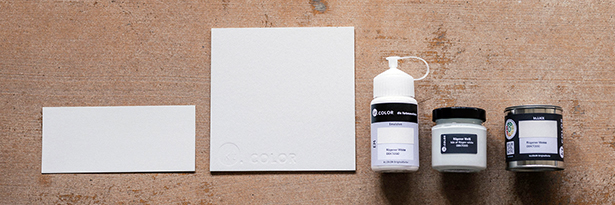
Handgefertigte Musterkarte im Format 21 × 9 cm mit Finish Emulsion
Handgefertigte Mustertafel aus Buchbinderkarton im Format 20 × 20 cm mit Finish Emulsion
Eine Musterflasche Emulsion ist ausreichend für ca. 1 m2
Ein Musterglas Satinée ist ausreichend für ca. 1 m2
Eine Farbdose kt.LACK ist ausreichend für ca. 1m2
Summe:
€ 0.00
Sofort verfügbar, Lieferzeit 2-6 Werktage
MwSt. exkl.