Ihr Warenkorb
Total
0.00
Continue Shopping

Swiss Architectural Color
Viennese Red. French White. Bernese Sandstone. Queen Lucia Yellow. ktCOLOR is a Swiss paint manufactory producing handcrafted architectural paints from natural and mineral pigments since 1998.
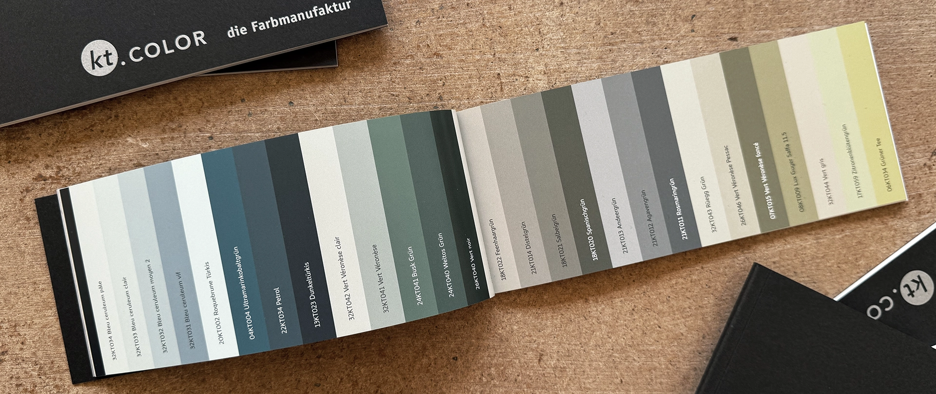
180 handcrafted architectural colors, made in our Swiss paint manufactory from more than 120 natural and mineral pigments — blue stones, red earths, soft chalk, and artists' pigments rarely used today.
Colors for architecture that does not shout. Colors of exceptional depth and quiet luminosity, mixed by hand with mineral binders that allow walls to breathe and respond naturally to changing light. They give walls, ceilings, woodwork, and facades a timeless presence—natural, enduring, and unmistakably handcrafted.
Swiss Architectural Color
Viennese Red. French White. Bernese Sandstone. Queen Lucia Yellow. ktCOLOR is a Swiss paint manufactory producing handcrafted architectural paints from natural and mineral pigments since 1998.
180 handcrafted architectural colors, made in our Swiss paint manufactory from more than 120 natural and mineral pigments — blue stones, red earths, soft chalk, and artists' pigments rarely used today.
Colors for architecture that does not shout. Colors of exceptional depth and quiet luminosity, mixed by hand with mineral binders that allow walls to breathe and respond naturally to changing light. They give walls, ceilings, woodwork, and facades a timeless presence—natural, enduring, and unmistakably handcrafted.
ktCOLOR at Zurich Design Weeks 2026
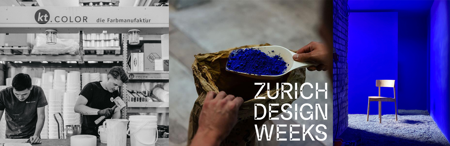
From 17 to 27 September 2026, ktCOLOR will be part of Zurich Design Weeks, Switzerland's largest design festival. At the House of Interior, we will present the installation Blau machen ("Making Blue") and host the evening talk Blau gestalten ("Designing with Blue"), exploring blue - one of the most powerful tools in architectural color design.
Throughout the festival, founder Dr. Katrin Trautwein and the ktCOLOR team will welcome visitors to guided tours of the installation, sharing surprising insights into the design principles behind blue and its influence on light, space, and perception.
Please note that all talks and guided tours during Zurich Design Weeks will be held in German. Design professionals interested in an English-language workshop are warmly invited to contact us. We will offer workshops in English at our Swiss manufactory from January 2027 onwards.
Color Consulting with a Clear Method
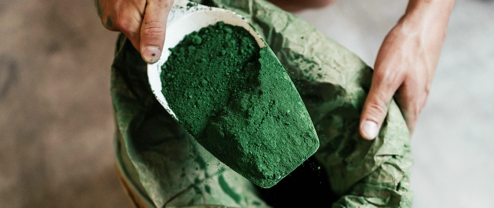
The infinity of Ultramarine. The depth of Umbra. The luminosity of Rügen Chalk. The heritage of Veronese Green.
Our color consulting follows a clear methodology. We analyse light, space, and architecture to develop architectural color concepts that create atmosphere, define spatial relationships, and lend building a clear identity. More than 25 years of research into rare natural pigments and their spatial function provide the foundation for confident color decisions.
Whether you are seeking guidance for a single color decision or a comprehensive architectural color concept, we tailor our consulting to the requirements of your project.
Confident Color Decisions with Original Color Samples
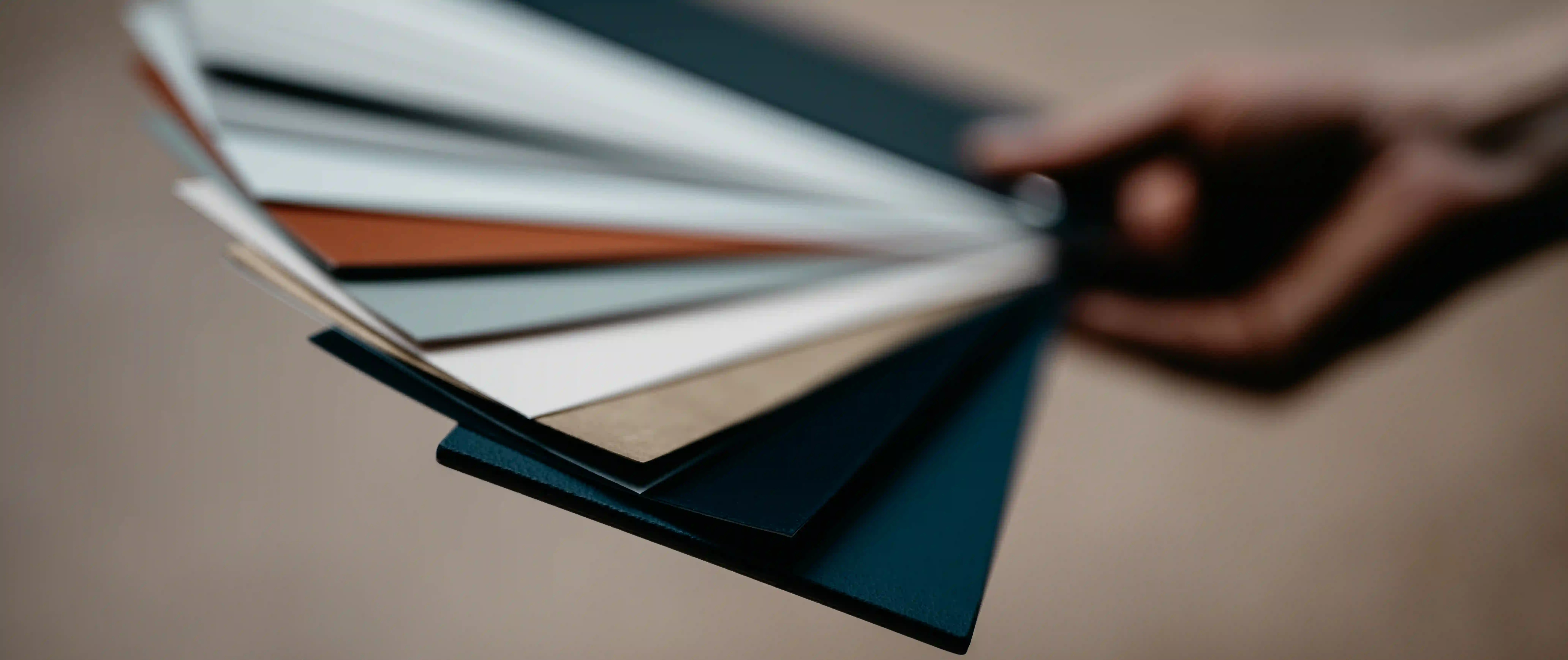
Handcrafted color cards and paint samples are among the most important tools in architectural color design.
They reveal materiality, depth, and the way color interacts with light exactly as it will appear on the finished surface. Available in a range of formats for every ktCOLOR color, they provide a reliable foundation for confident color decisions.
Our new complimentary ktCOLOR catalogue, featuring the complete collection of Swiss Architectural Colors, is currently in print. Subscribe to our newsletter to be among the first to know when it becomes available.
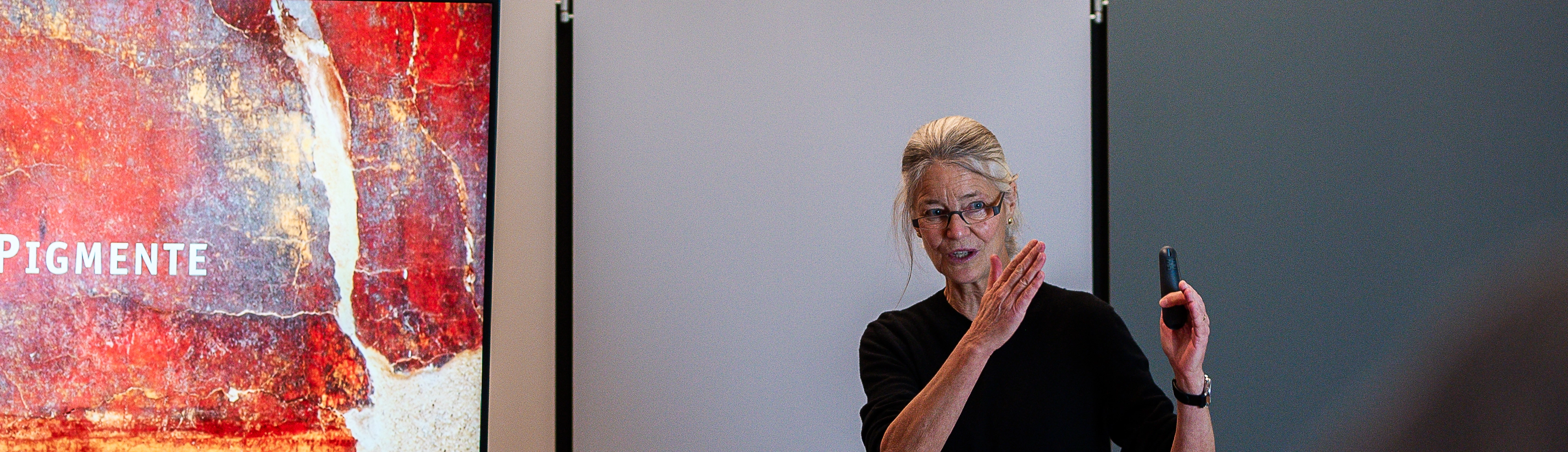
Campus & Webinars - Individual Formats
Seminar, webinar, workshop, lecture, or paint manufactory tour – at our Swiss paint manufactory, at your offices, or online. Dr. Katrin Trautwein and her team tailor every format to your audience, adapting the content to their interests, level of expertise, and project goals.
Topics range from natural pigments, materiality, light, spatial perception, and architectural color design to the color concepts of Le Corbusier and Eileen Gray.
Frequently Asked Questions
How does ktCOLOR's approach to paint colors differ from other paint manufacturers?
ktCOLOR doesn't produce push-button colors. Each color is made to order from its own pigment formula. Each architectural color is built pigment by pigment to fulfill its precise spatial function. The ktCOLOR manufactory works with over 120 different pigments, most of them mineral-based and natural. Only 14 of these are also used in the industrial tinting systems widely used in the premium paint industry.
Why does ktCOLOR use umber instead of black, and Carrara marble powder, champagne chalk, China Clay and chalk from the Isle of Rügen instead of titanium white?
Black and titanium white are standard pigments in industrial paint production. They simplify formulas but often make colors look flatter. ktCOLOR instead darkens colors using eight different umbers and lightens them with natural white pigments such as Carrara marble powder, champagne chalk, Rügen chalk, or kaolin (porcelain clay). This creates colors with greater spatial depth and a more vibrant effect in light.
What does "manufactory" actually mean at ktCOLOR?
Every color at ktCOLOR is made by hand. Natural pigments vary slightly in their optical properties from batch to batch, which is why every formula is individually adjusted. Push-button colors require standardized pigments – natural pigments, by contrast, demand experience and the hands-on calibration of every single batch. That's exactly what sets a genuine color manufactory apart.
What role does ktCOLOR play in Le Corbusier's colors?
Dr. Katrin Trautwein has been researching Le Corbusier's original color formulas since 1999. Based on historical findings, she reconstructed 81 original formulas from the pigments Le Corbusier used in his 1931 and 1959 color collections, as well as in buildings such as the Villa La Roche, the Maison Blanche, and the Frugès housing estate. Until 2012, ktCOLOR produced these colors under license. Today, ktCOLOR produces the formulas developed by Katrin Trautwein under its own name – from the original pigments and with a signed certificate of authenticity documenting the shade, binder, and batch number.
Who provides the scientific foundation behind ktCOLOR?
ktCOLOR is founded on the work of Dr. Katrin Trautwein, a chemist (Dr. sc. nat., ETH Zurich) and color researcher. For over 25 years, she has researched pigments, historical color palettes, and architectural color concepts, including the colors of Le Corbusier. Her research forms the foundation of all color development at ktCOLOR.
What is the ktCOLOR Farbkonzepter design tool?
The Farbkonzepter is a professional design tool for architects and designers. It supports the systematic development of individual color concepts using 180 hand-painted original samples, clear selection criteria, and an accompanying video course. Unlike a classic color fan deck, the Farbkonzepter isn't a color catalog but a decision-making tool for professional color design.