Ihr Warenkorb
Total
0.00
Continue Shopping

Color Concepts für Public Spaces
Every public space serves a different purpose, and its color concept should support that purpose. Whether a museum, hotel, school, office, healthcare building, restaurant, or retail environment, each requires its own atmosphere. What they all share is the need for color to provide orientation, strengthen identity, and support the architecture rather than compete with it.
The following color concepts for public spaces were developed with ktCOLOR Architectural Colors made from natural and mineral pigments. They demonstrate how color, light, and materials come together to create calm, coherent architecture that feels authentic, provides clear orientation, and is designed to endure.
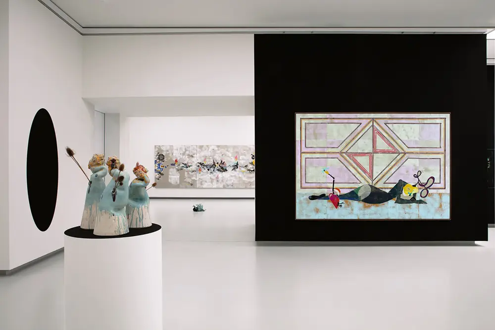
43KT05 Ivory Black. Foto ©Alistair Overbruck, Kunsthalle Tübingen

24KT026 Sand. Foto ©Robert Rieger, Arlberg Club Haus

10KT003 Payne’s Gray. Foto ©Philip Heckhausen
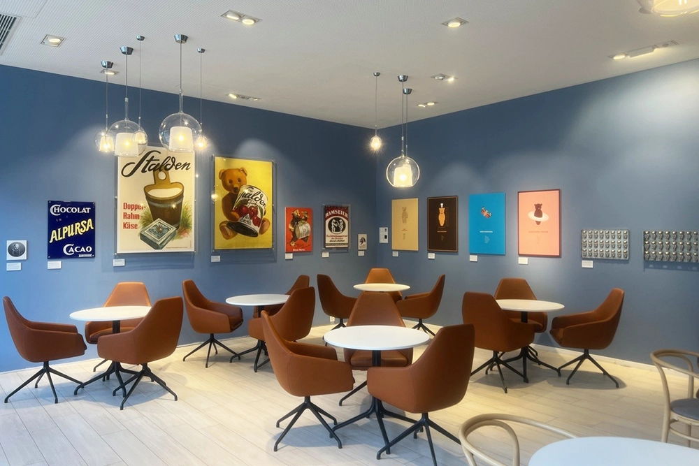
20KT305 Nattier’s Blue. Foto ©Serafin Home
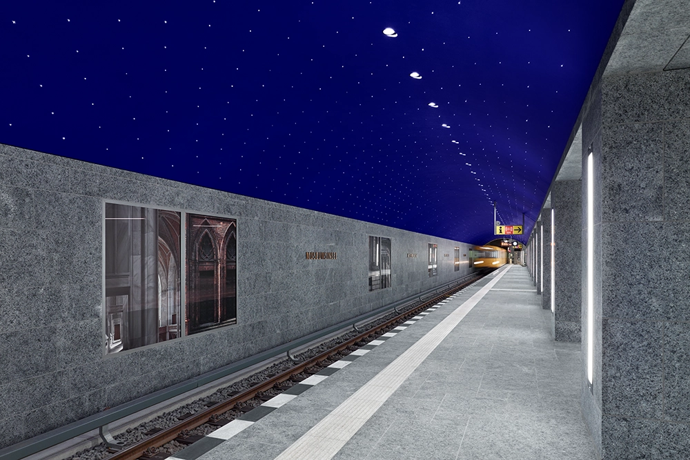
03KT001 Ultramarine Blue. Foto ©Stefan Müller
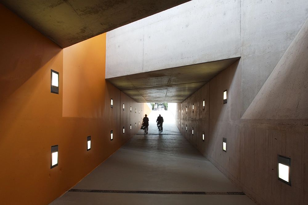
43KT22 Persian Orange. Foto ©Ostertag Architects
How to Design Ideal Color Concepts for Public Spaces
ktCOLOR creates colors and color concepts that combine functionality with an exclusive aesthetic – in private homes and in public spaces alike. Color guides, structures, supports a space's function, and shapes the wellbeing of the people who move through it.
Orientation and functionality take center stage: clear color contrasts guide and help with navigation, while deliberate accents define areas and reinforce how they're used. Quiet zones benefit from consistently soft, harmonious colors, while more dynamic areas can carry stronger contrasts.
Color captures light and carries it forward. ktCOLOR's high-quality, handmade paints unfold a unique depth and spatial presence through their natural pigments. The result: spaces with character that are as intuitive to read as they are visually compelling.